The challenge
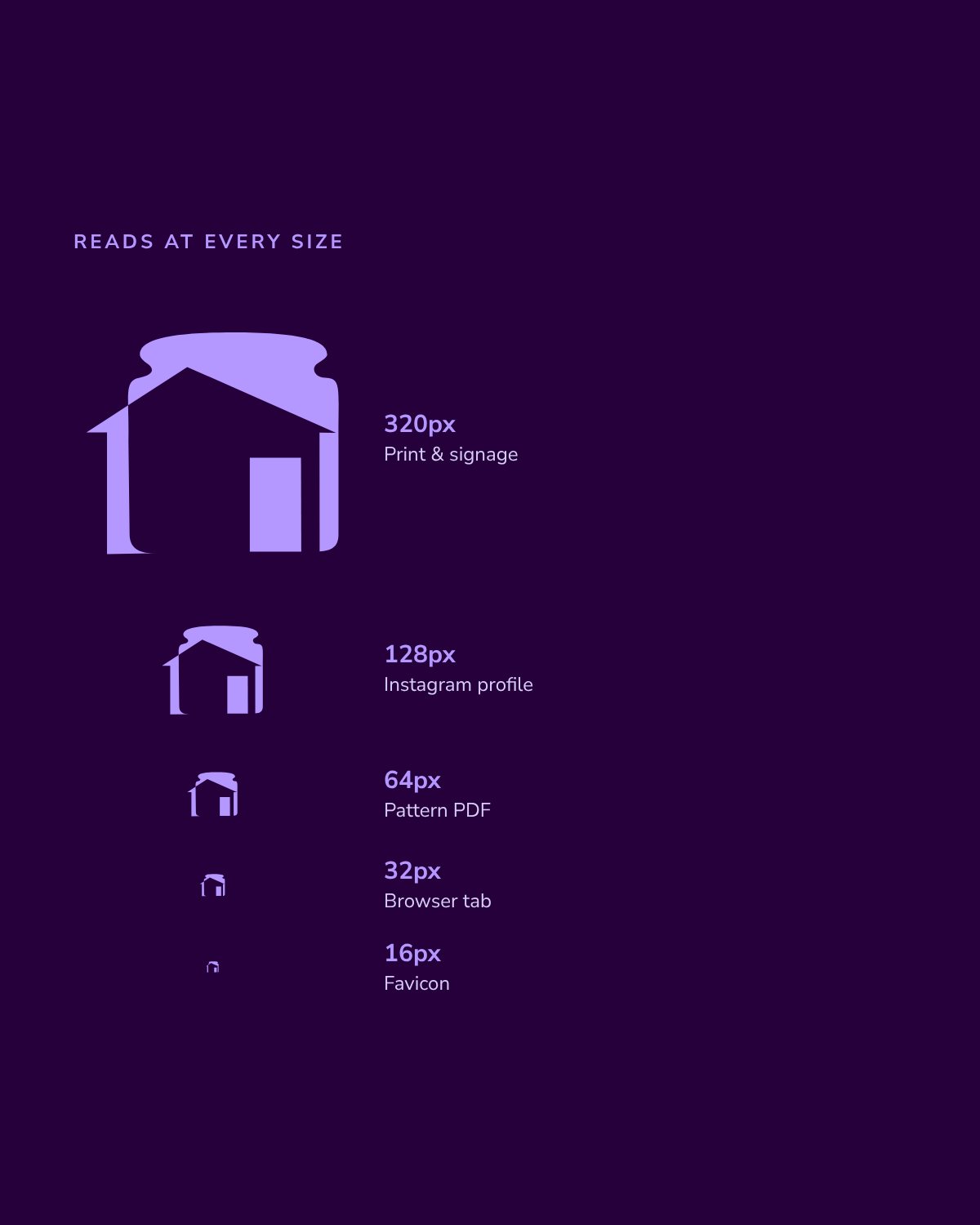
The business started with crochet pieces for friends and family and grew into markets and work with local schools and businesses. Its old logo was a traced photo of the purple house itself. It needed something professional that still felt a little unexpected, stayed timeless instead of trendy, read clearly at favicon size, and could stretch to new product lines later.
The approach
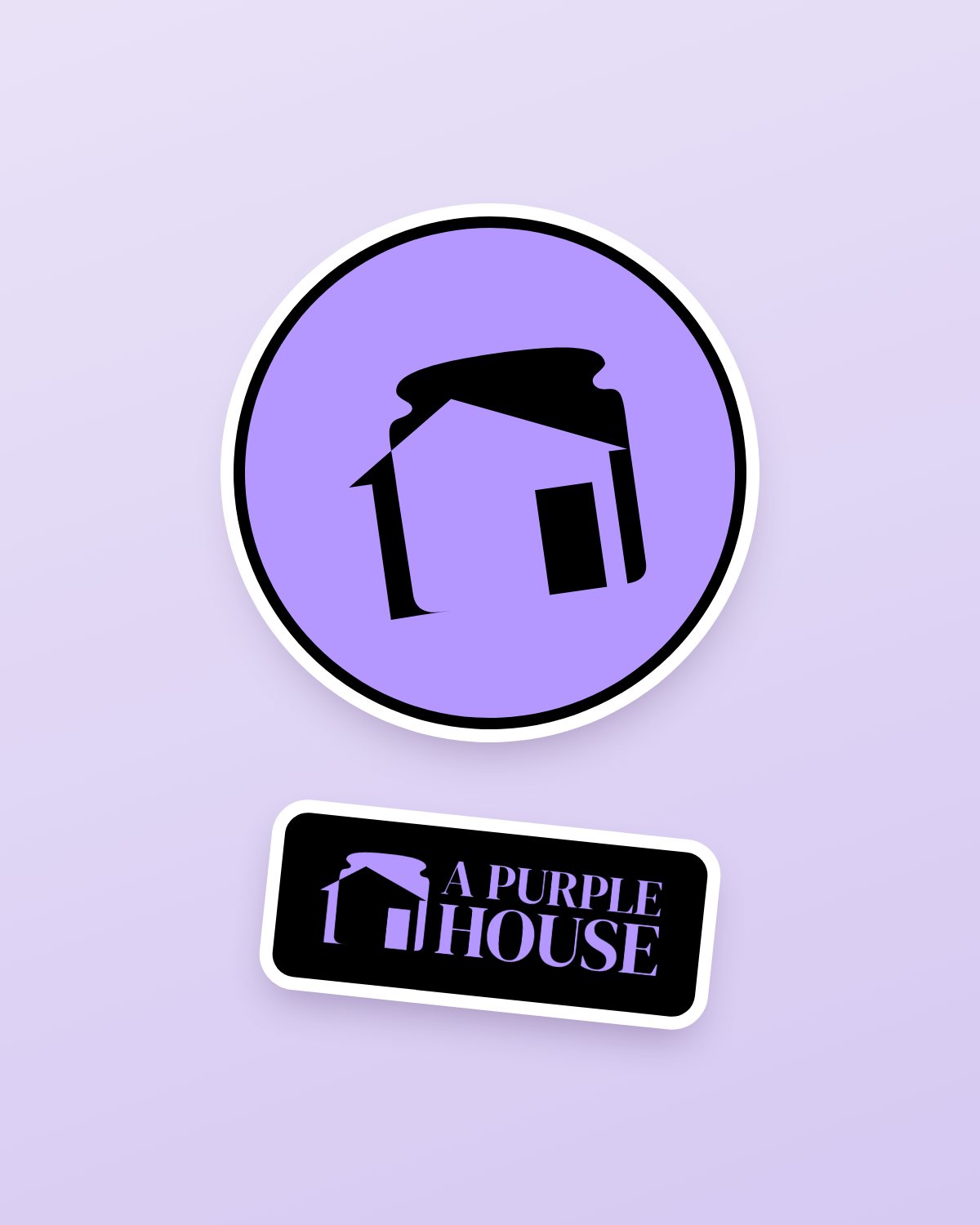
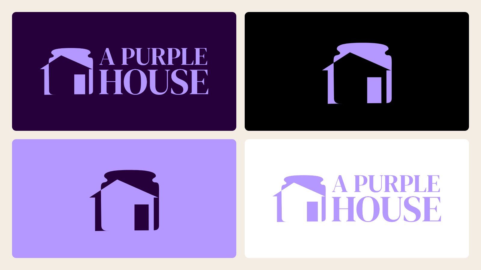
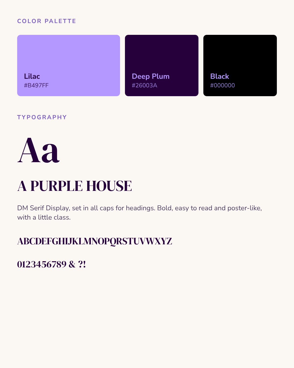
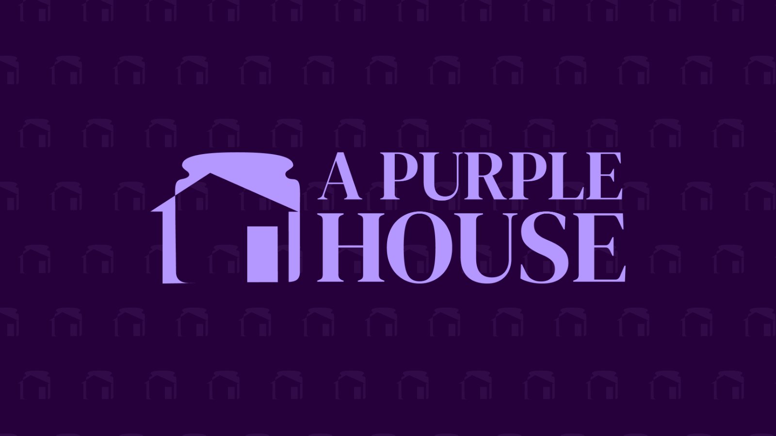
I started with the symbol, since the mark had to work without words. The house roofline doubles as a lidded jar, a nod to the curated oddities the shop is known for, and negative space forms the door. For the type, I chose a bold, all-caps serif that is easy to read and feels a bit like a vintage poster. The palette keeps it to two colors: lilac on deep plum, with black for sticker-style outlines.
The result
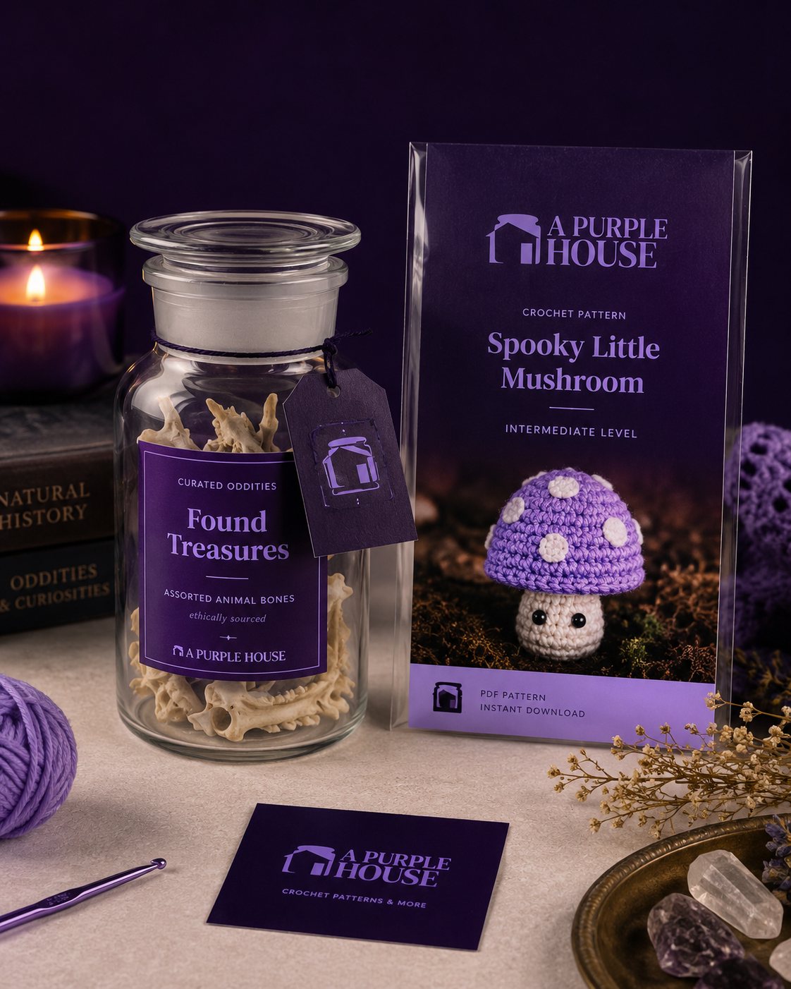
A complete logo suite in four color versions, plus a palette, a font pairing and a one-page brand sheet. Every file came in JPG, PNG, SVG and AI, ready for pattern PDFs, product labels, market signage and Instagram.