The challenge
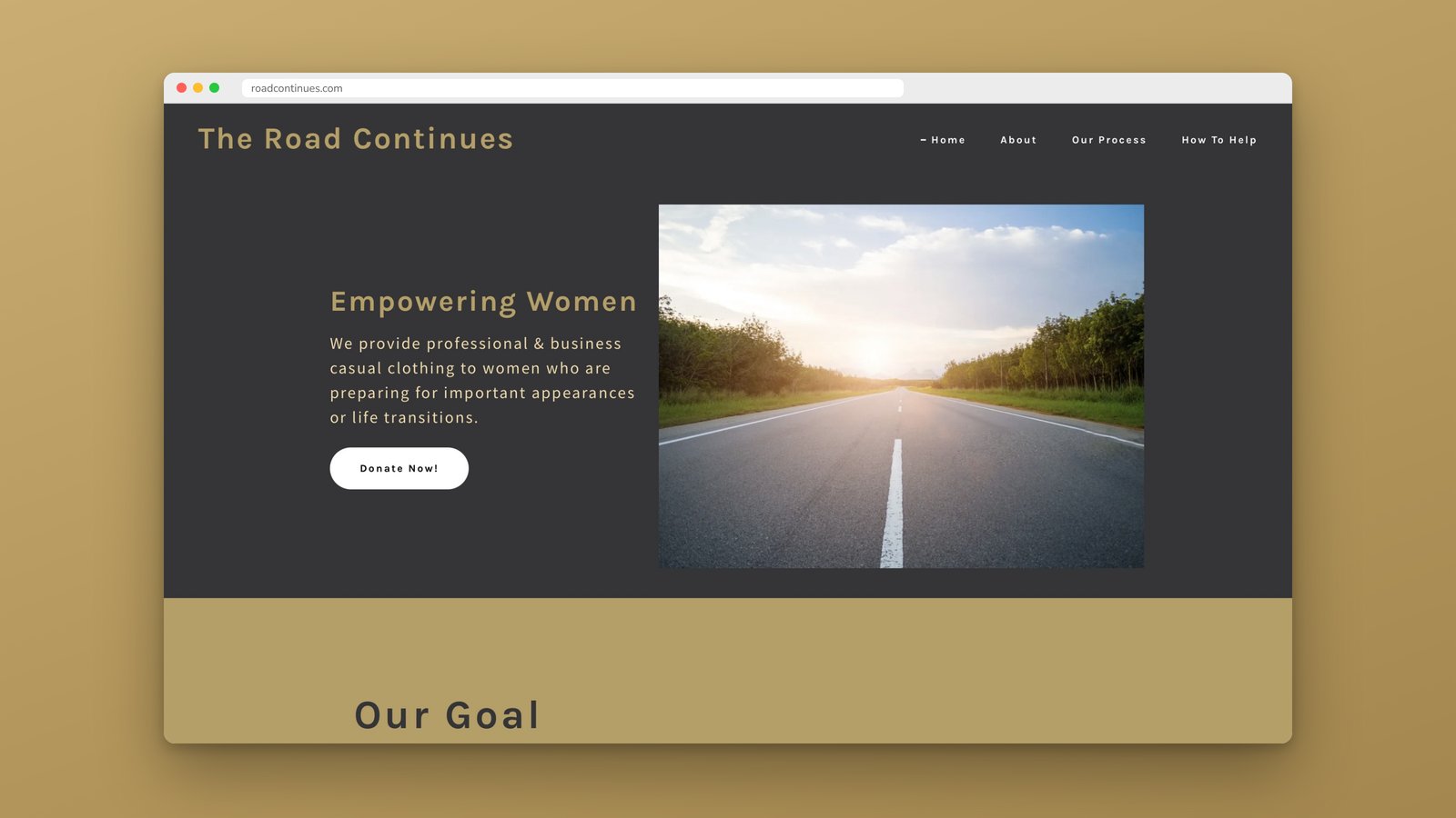
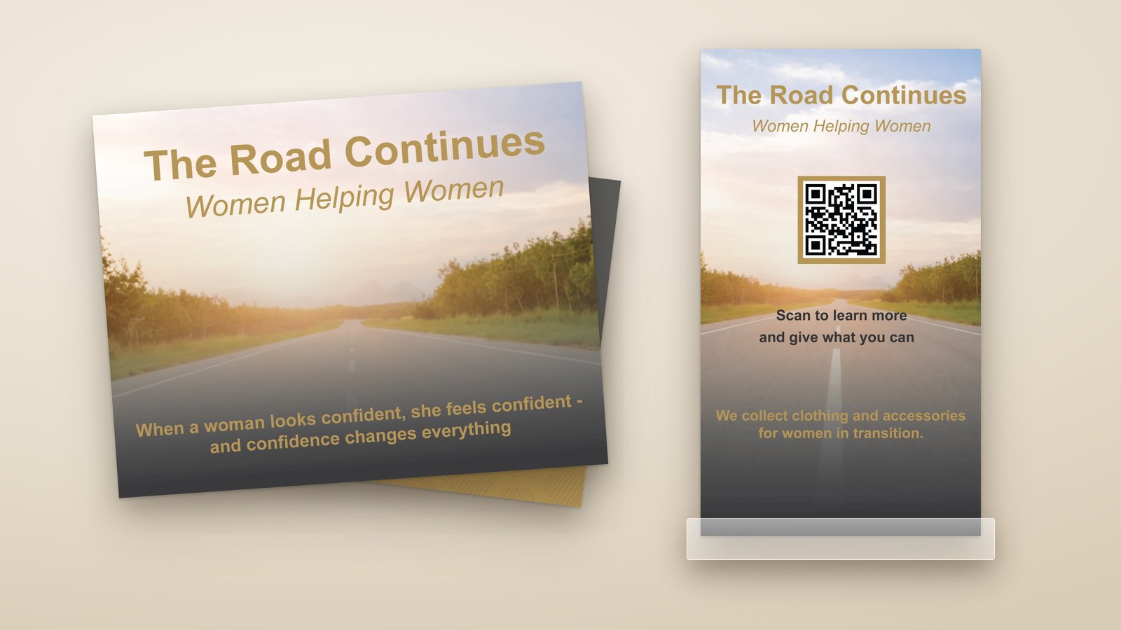
The founder didn't want a logo. She wanted one photo, a quiet road heading into the sunrise, to carry the brand, because it says exactly what the organization does: helps women keep going. Her materials had grown piece by piece, so the website, handouts and decks didn't feel like they came from the same place.
The approach
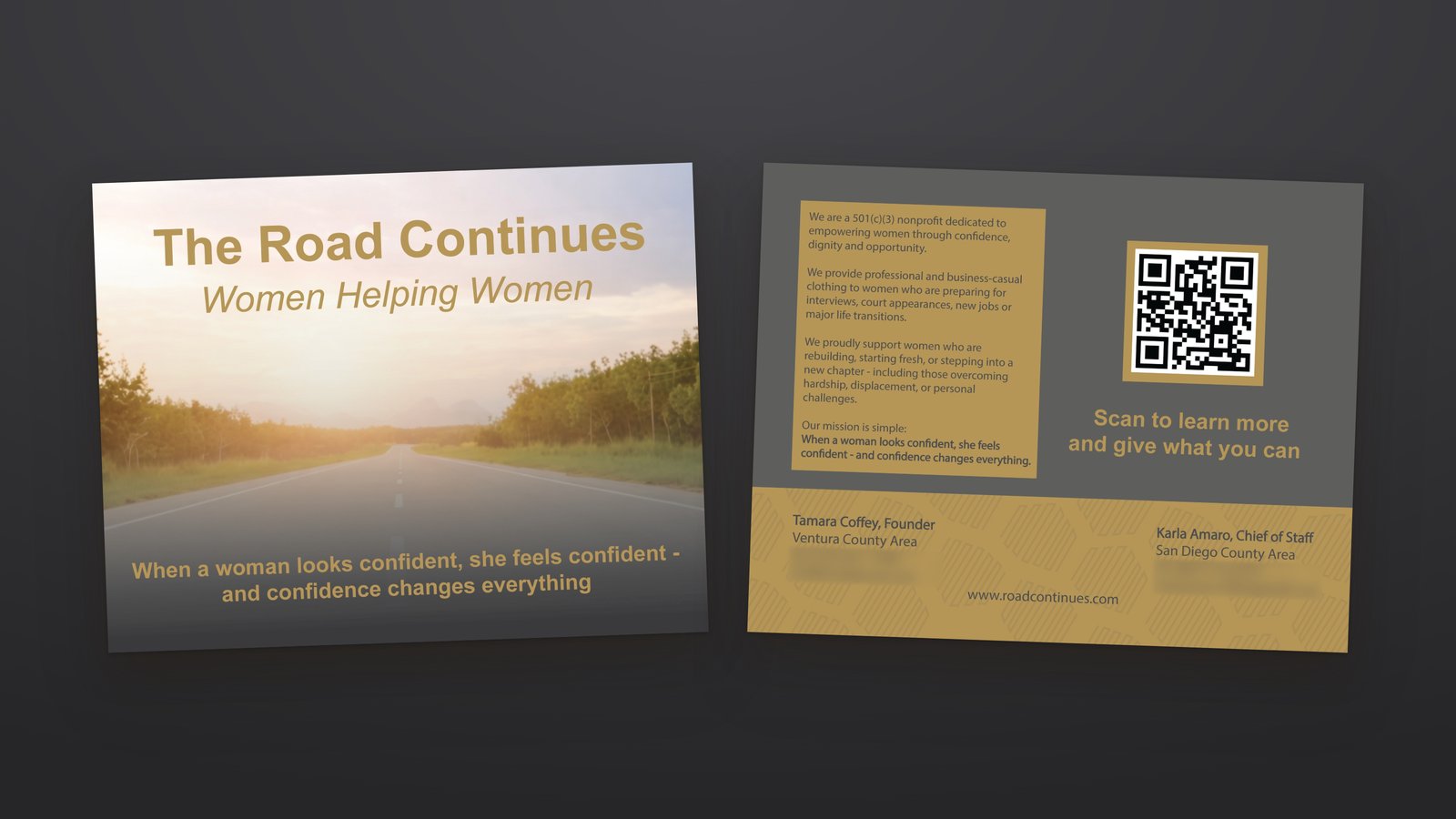
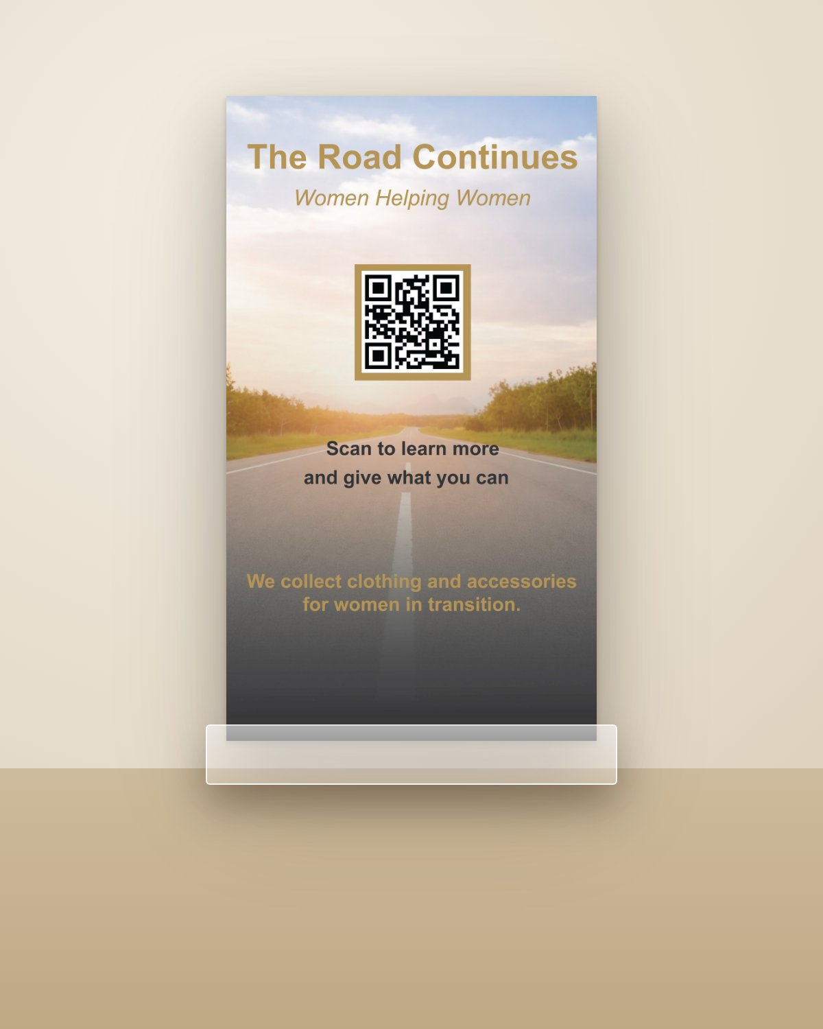
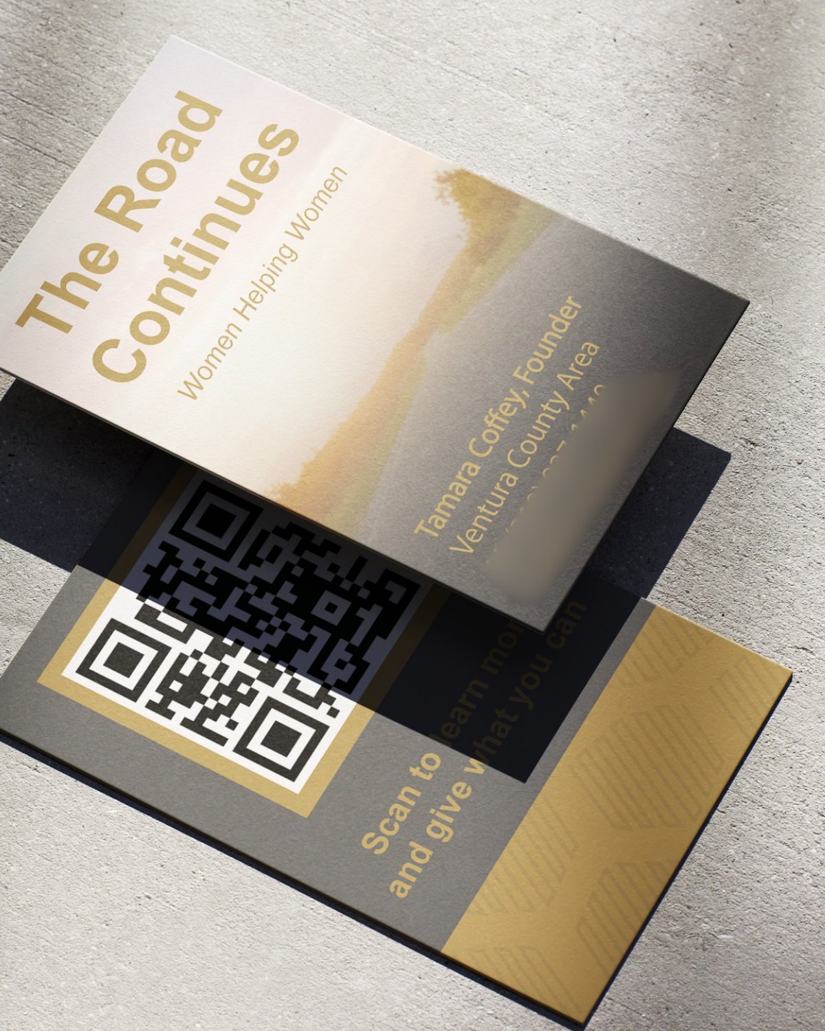
With no logo to lean on, consistency had to come from everything else. I let the road photo do the heavy lifting on every printed piece and paired it with two colors pulled from it, a warm gold and a deep charcoal, plus the same clean sans-serif type throughout. The mission line, "When a woman looks confident, she feels confident," shows up wherever there is room for it, and QR codes connect each print piece back to the website and donations.
The result
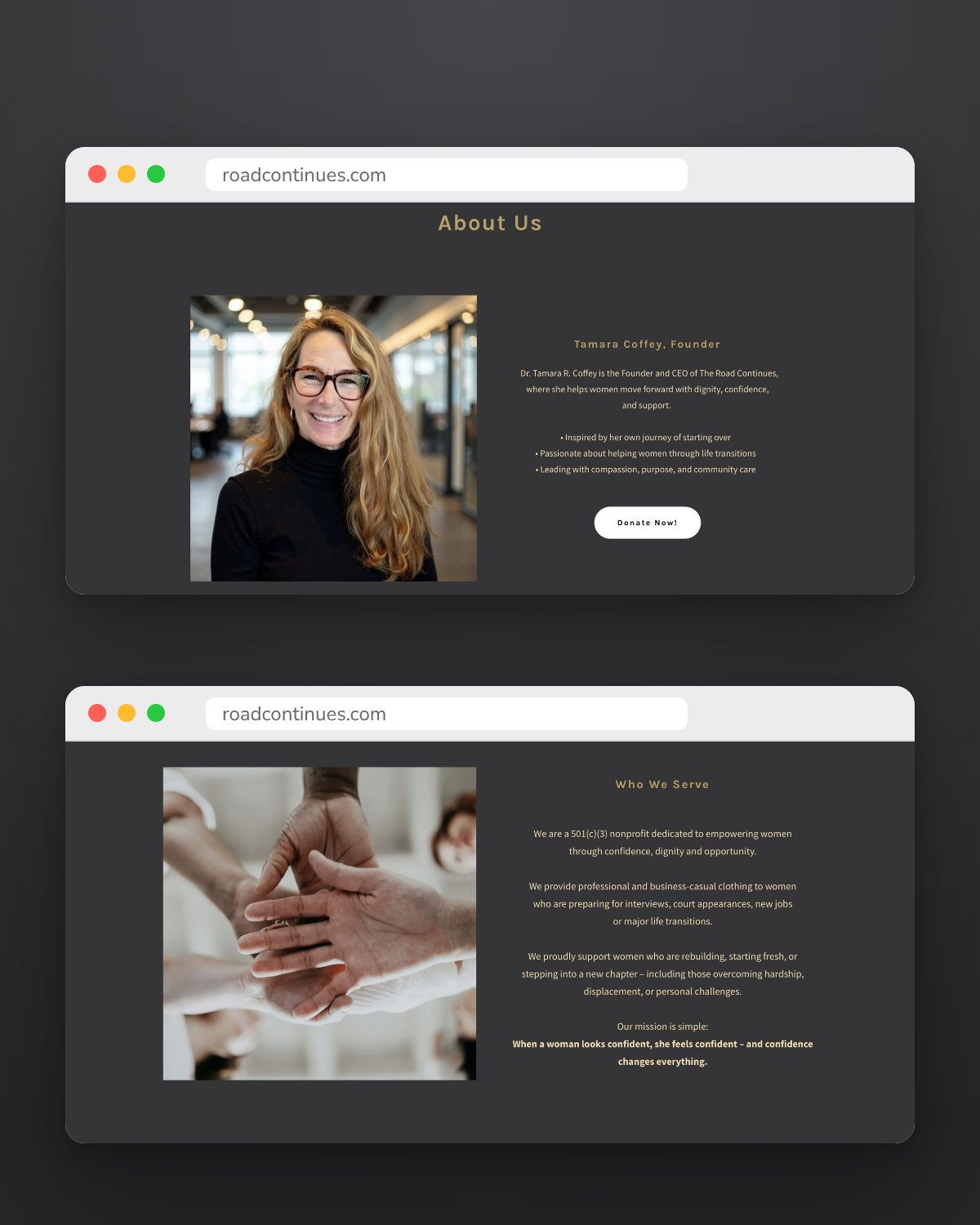
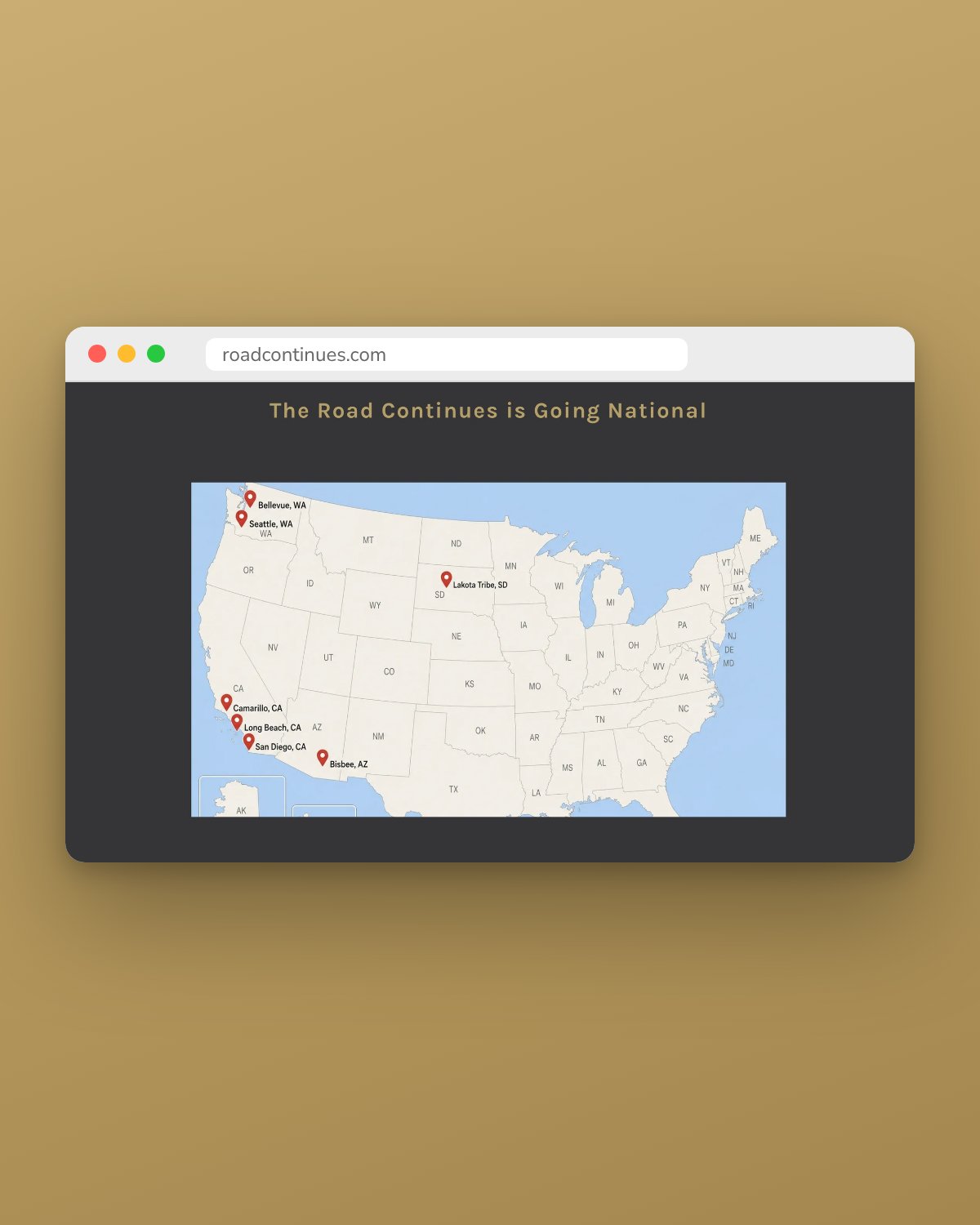
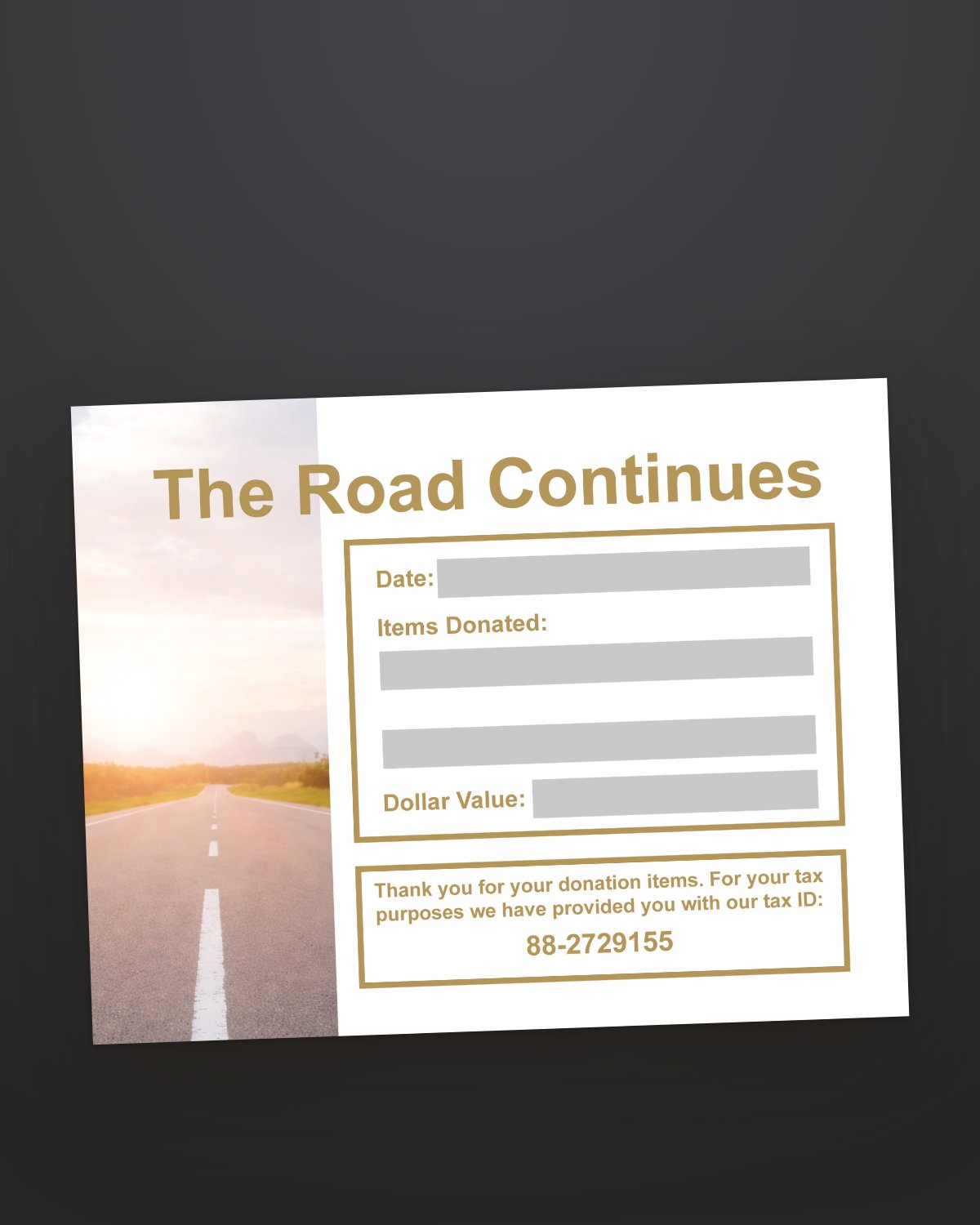
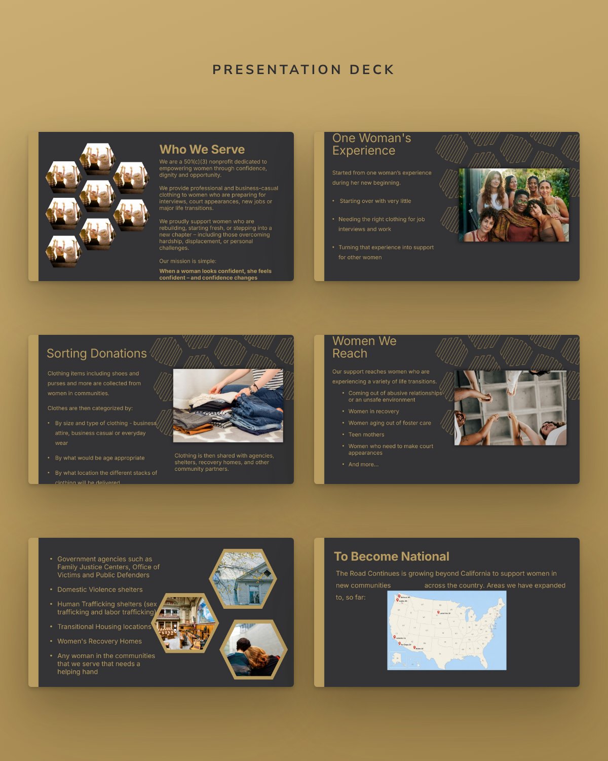
A refreshed website and a full family of materials that read as one organization: postcards, a tabletop sign for donation drives, business cards, a branded donation receipt with the tax ID donors need, and presentation decks for events like National Women's History Month, all ready as it expands beyond California.