The brief
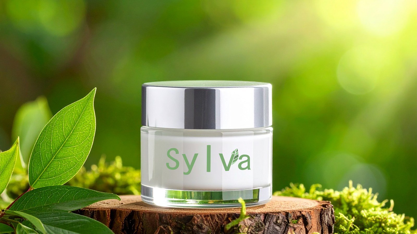
Sylva is a small-batch line of botanical creams and serums for people who want simple, plant-based skincare. The brand had to look gentle and trustworthy next to big-name jars on a shelf, feel natural without looking homemade, and leave room to grow into new products.
The approach
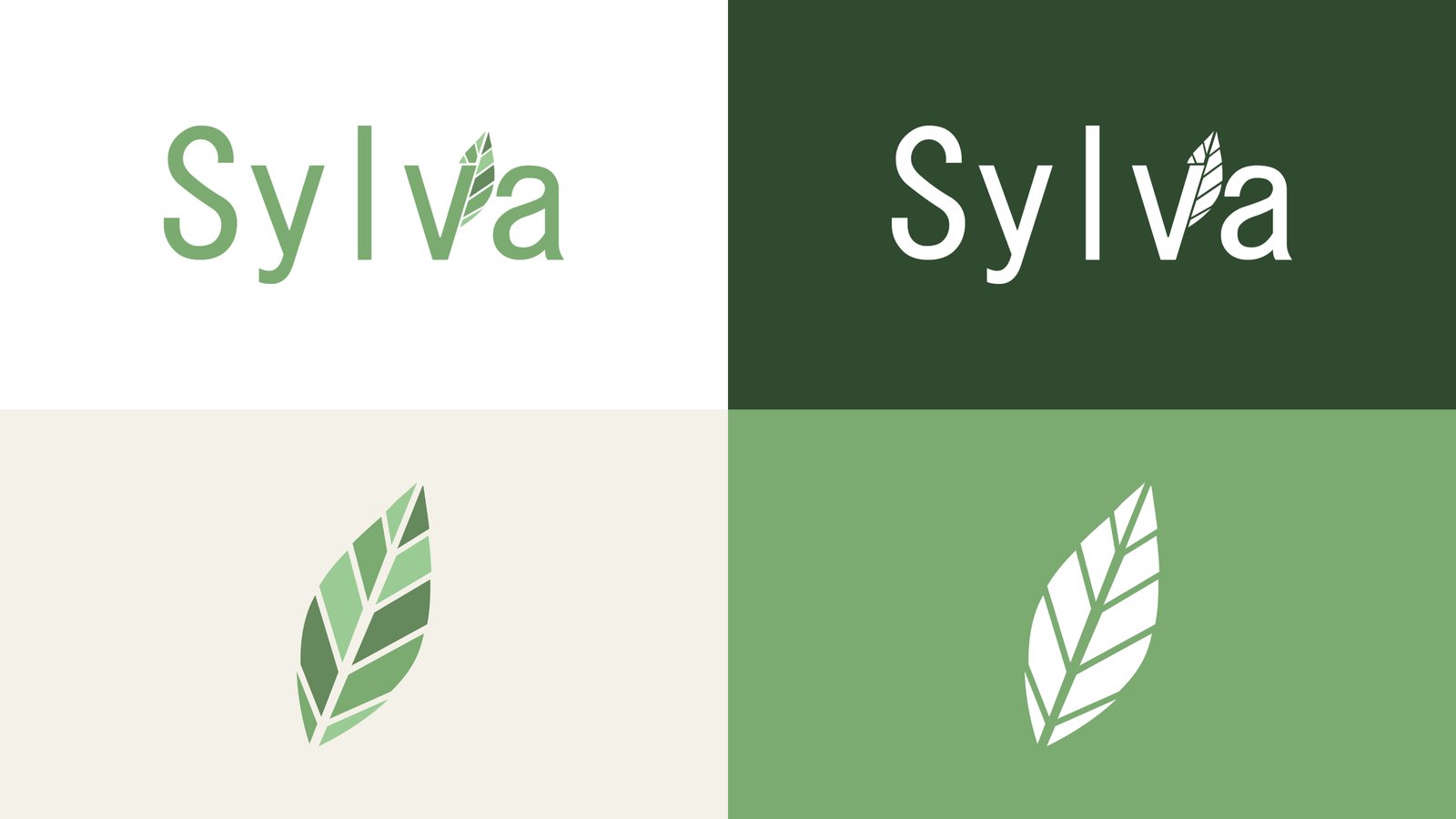
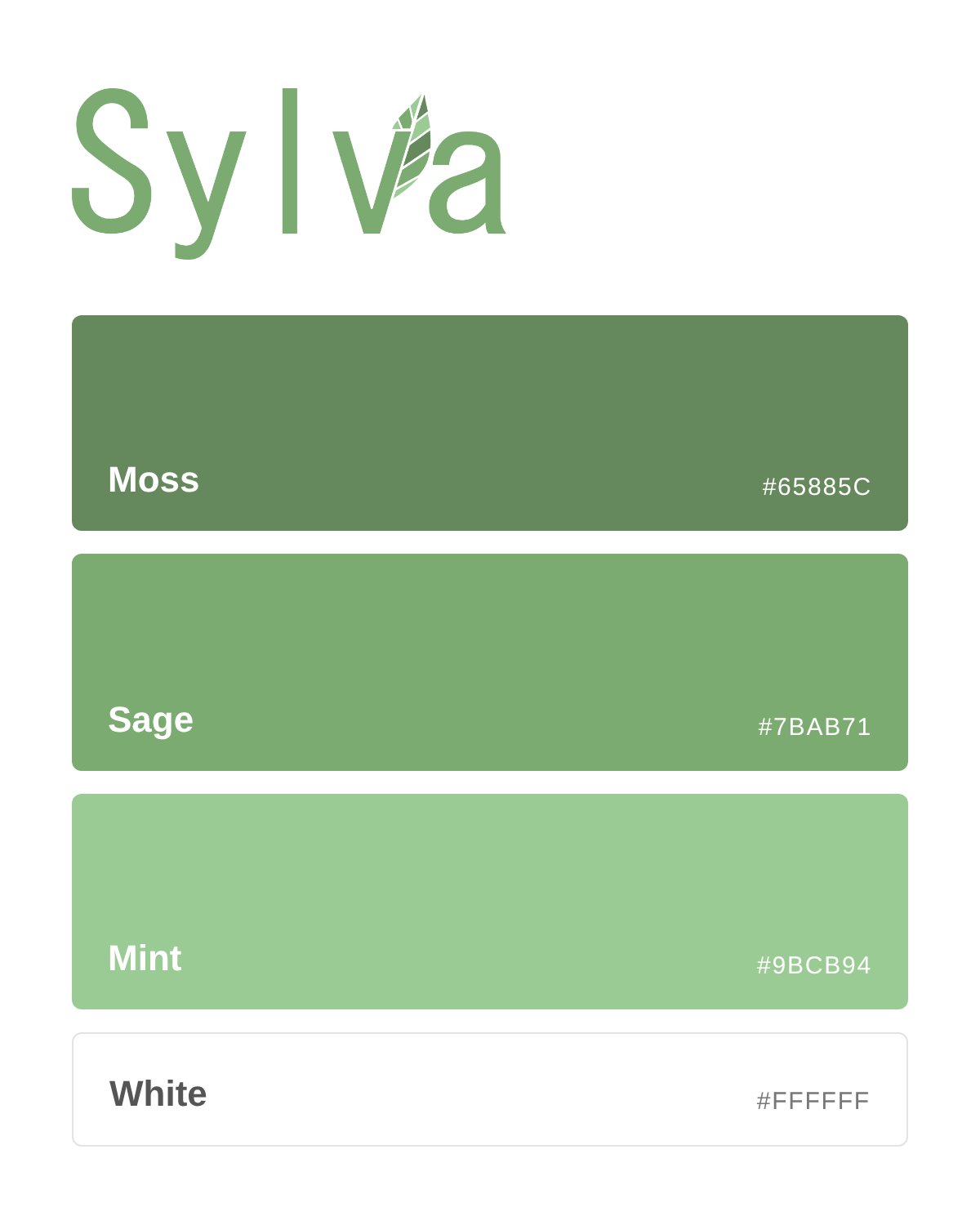
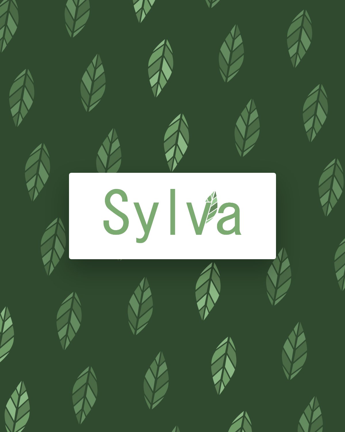
The name comes from the Latin word for forest, so the leaf became the heart of the identity. I built the mark from faceted segments in three greens, like sunlight breaking through leaves, and tucked it into the wordmark so the leaf grows right out of the "v." Wide, airy letter spacing keeps the type calm and modern, and the palette runs from deep moss to soft mint so every piece feels fresh but grounded.
The result
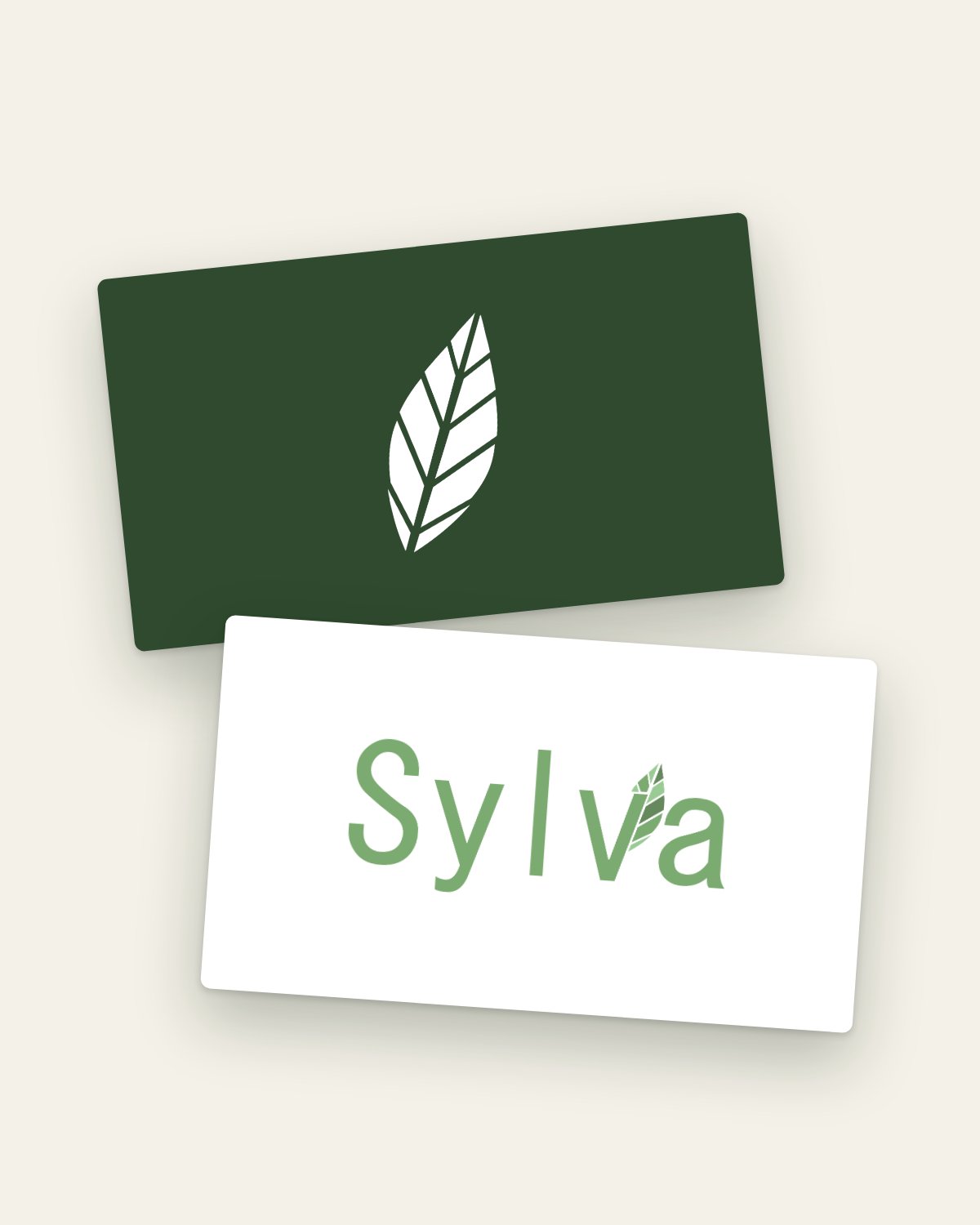
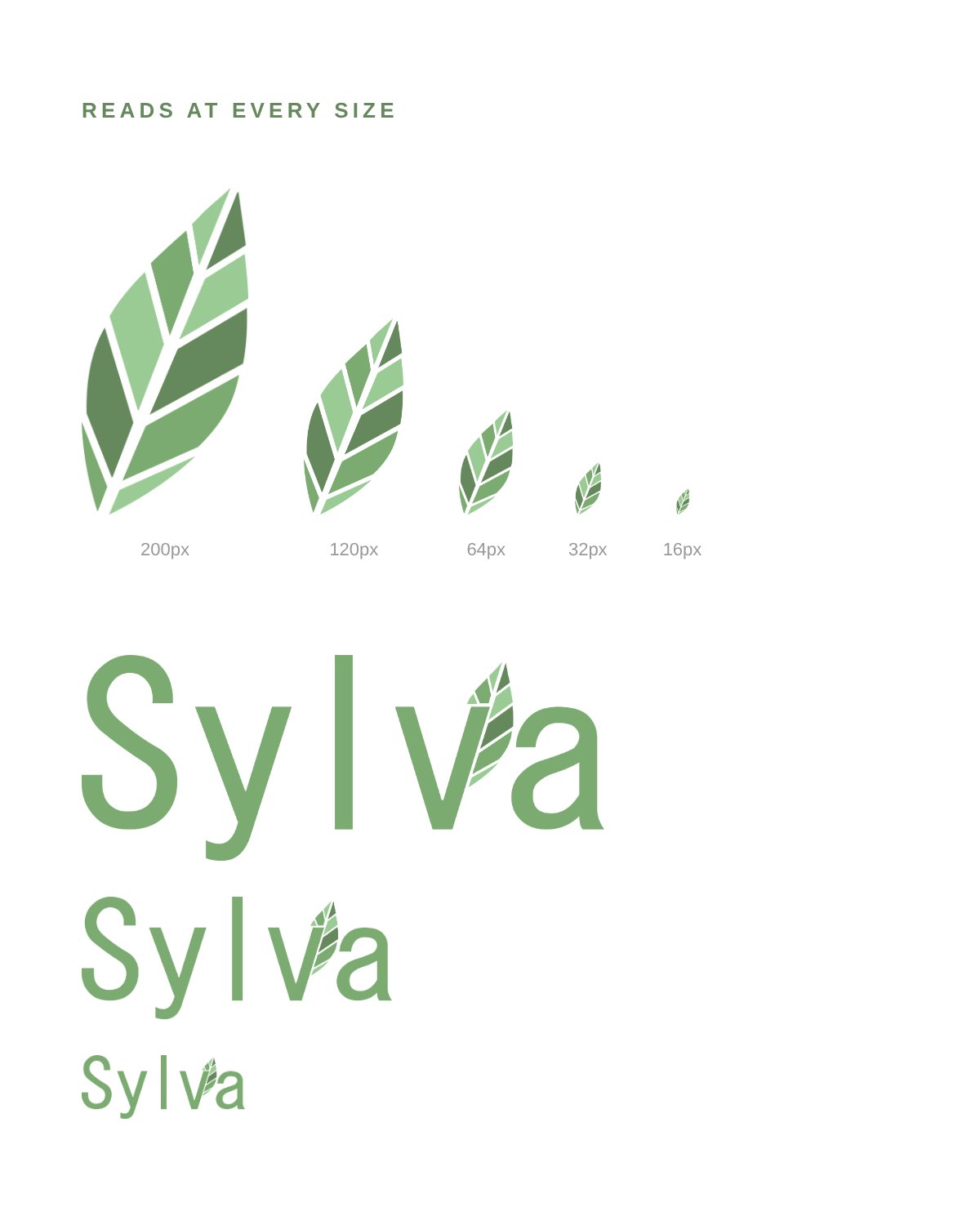
A complete logo suite with a wordmark and a standalone leaf mark, a three-green palette, and a leaf pattern for tissue paper, boxes and social posts. The mark holds up from a jar label down to a favicon, and it's flexible enough to color-code future products.